When we travel somewhere, I love to take lots of photographs. They are a wonderful reminder of our visit, the colours, the scenery, the awesome beauty of the place we are exploring. Every time, I look at the imagery it brings me back, I can almost feel the warmth of the sun on my face and the breeze catching my hair!
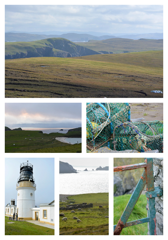
Later when I’m home I like to use my photos to help choose colour schemes for a project I’m working on. I create a collage of imagery and then I often prefer to use one of the closeup photos to choose a selection of colours.
For the Branches and Buds Pullover I used the photo of the peeling gate that had been taken beside Sumburgh Lighthouse on one of the days we visited it and walked around the building looking at the views over the perimeter wall.
A long time ago, soon after I returned from University in 1991, my mum treated me to having my colours done, for my birthday present. It was so much fun, and it turned out that I’m a Cool Vibrant (Winter) palette. I still have my Colour Harmony Fan and refer to it when I’m choosing colours particularly if I’m going to be wearing the garment or accessory that I’m planning on knitting. I’m not exacting about it, so long as the colour is close or a tone or shade of the colour in my Fan I’m happy!
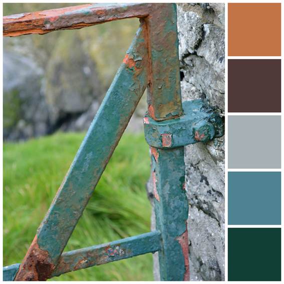
Sometimes, I will create a moodpboard and swatches if I’m choosing several colours for a project but for a simpler colour scheme like this, I don’t go into as much detail. For the Branches and Buds Pullover designed by Carrie Bostick Hoge for Making No 1 Flora magazine I wanted a dark colour for the main colour of the sweater with a paler contrasting colour.
Using the image above of the rusty peeling gate, I chose to use the dark brown for the main colour and the paler light turquoise for my contrast. Although, I love dark brown and it is a colour in my Harmony Fan, it isn’t a colour I wear very often.
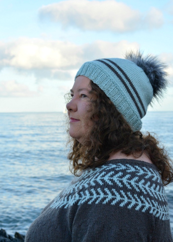
I did think about the buds on the sweater, and intended to use the silver grey, rust and forest green for these. I chose a beautiful large faux fur pompom that is the same colour as the silver grey and darker grey in the stone wall.
Do you use your own photographs for choosing colour schemes?
SaveSave

Good evening Niolette.. I am just starting your beautiful mitre square blanket and have completed my first 4 squares.. i am now stuck…do I knit another 4 squares and stitch them to the original 4. I think I staet square 5 by casting on 24 and then picking up 24 stitches across square 3. Can you please advise me… I want to continue. Many thanks
Sues
I have always love how you inspired by your surroundings to choose your knit colors….always remembering yhe bluebells…one of the first inspirations that you had…that I remember reading….This post …bring inspired by the oxidation of metal on gate…fence hardware….beautiful….Love your knits…it must give you an incredible feeling to take that spin fiber and create your mzgic….only and most always wishing it was for Sasha dolls…but at least you can wear those gorgeous knits…Awesome to see a post from you after so long….
Great to see you’re blogging again 🙂
Thank you.