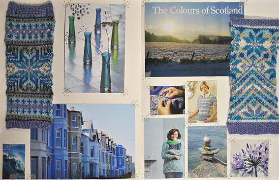
I love how intricate the beautiful fair isle motifs look and yet I’m only ever knitting with 2 colours in a row. I think the darker colours really stand out against the paler background. This is shown wonderfully well in the photograph that I used to name the Moodboard – The Colours of Scotland.
I also noticed that a repeating motif on these moodboards was the agapanthus flower in several different colours. When I was a child my mum used to buy me colouring books which I coloured in and would create kaleidoscopic patterns. I always remember these when I am creating patterns on squared paper. I think it is why I enjoy playing with fair isle motifs so much.


I'd love to hear from you. Let me know what you think...