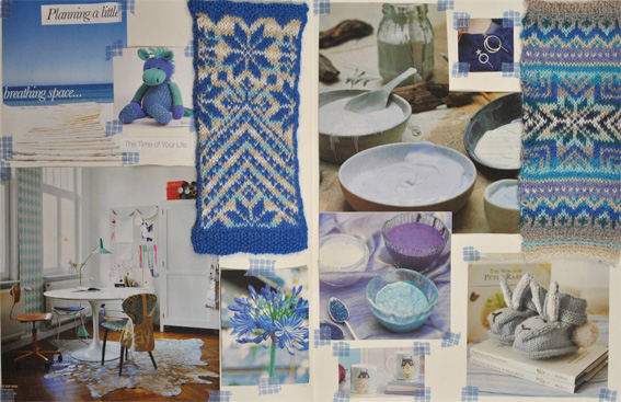
It amazes me how different the swatches and patterns can look using the same set of pale and dark colours. In the Moodboard – A Little Breathing Space I noticed that the pale blue looked quite purple beside the camel and turquoise colours. I was thinking about this when I was choosing the images that I wanted to work from.
Reader Interactions
This site uses Akismet to reduce spam. Learn how your comment data is processed.


I'd love to hear from you. Let me know what you think...