There is something incredibly moreish about the gorgeous soft Shetland wool. I have a large stash of shetland wool in both jumper weight and lace weight because it comes in such a glorious collection of colours – just like a knitter’s paintbox. But when you collect lots of single balls of different shades of shetland wool what do you then do with them?
How about a fair isle beanie?
Moodboard
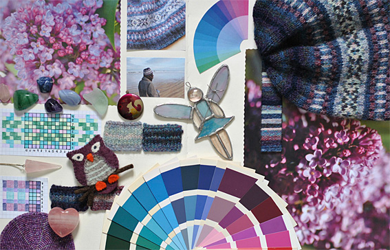
If you are anything like me, you always find it interesting to see where other knitters get their ideas for a colour scheme. I love creating the mood board for a project. It is a wonderful way of seeing if I like how the colours are working together. My mood board tends to grow along with the project.
My colour scheme was based on photos I took of the lilac blossom on two of my lilac trees in the back garden. I love the delicacy of the clusters of tiny blossoms and the different shades of blues and purples that show up in the pictures. I often find that I see so many different tints, tones and shades in my image that I didn’t necessarily notice when I was taking the photo.
A useful way of planning the colours is winding lengths of the yarns I am going to use onto a piece of card. It is a helpful way of making sure that you have a selection of pale tints that will contrast well against the darker shades.
The Charts
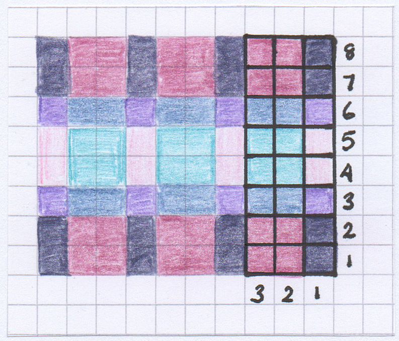
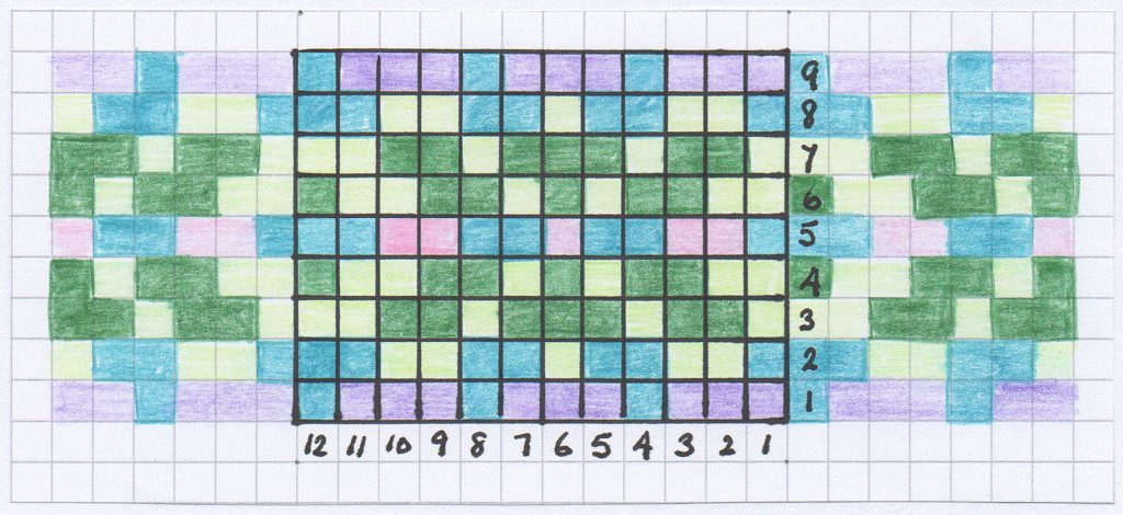
I planned the patterns on squared paper – these ones are coloured pencils on graph paper in some of my favourite shades of blue, purple and pink. -Then glued them down on my mood board.
- Chart B – Fair Isle Beanie
Colour Inspiration
When I am thinking about my colour scheme I watch out for disparate items that fit in with the colours I am planning to use. Some of the ones in the final photograph for this project include polished stones, a pale green piece of sea glass, a squirrel locket, my Brora owl brooch (a birthday present from my aunt), a stained glass angel (made by my mother in law) and even a beaded coaster, as well as, the finished beanie.
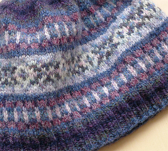
The striped knit samples show the order in which I chose to use the colours. The closeup photograph above shows the darker shades that were used for the k2, p2 rib. The final two rounds of mid-blue were used to separate the motifs. I worked on chart A then chart B then chart A. The same order of stripes used in the brim was repeated through the crown shaping.
Shetland Wool
I adore Shetland wool. It never ceases to amaze me how light it feels. The Shetland wool becomes fluffy and soft when it has been carefully hand-washed the first time. You need to be careful with the washing otherwise the wool will shrink and felt. Most of the yarn used in the Fairisle Beanie is Jamieson’s Spindrift, although I also used a few colours from Jamieson & Smith Jumper Weight and the Hebridean 2-ply range from Virtual Yarns… All of these companies have wonderful colour palettes and I happily choose the colours I want rather than being tied to a particular brand. Virtual Yarns is the wonderfully inspirational website of Alice Starmore.
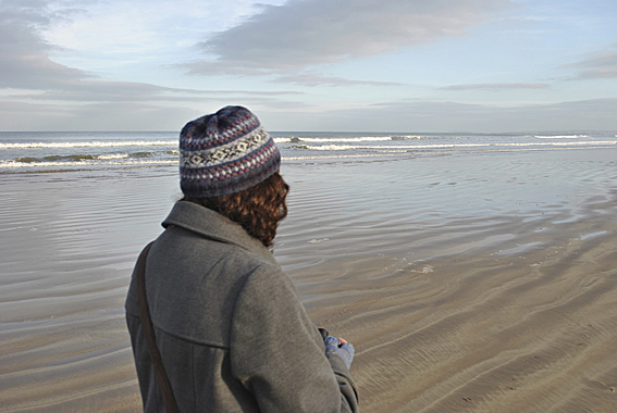
The beanie is the perfect choice for a walk along Benone Beach on the North Antrim Coast.
Do you use a mood board when you are choosing colours? How do you choose your colours for a new fair isle hat?

I'd love to hear from you. Let me know what you think...