When we visited Shetland in September 2015 we both took a huge number of photos. Since then I’ve been using my photos as colour inspiration for fair isle projects. Normally, I show photos of the finished items when I’m wearing them but the series A Shetland Colour Story will explore how I use my photos to help create a colour palette for the project I want to knit.
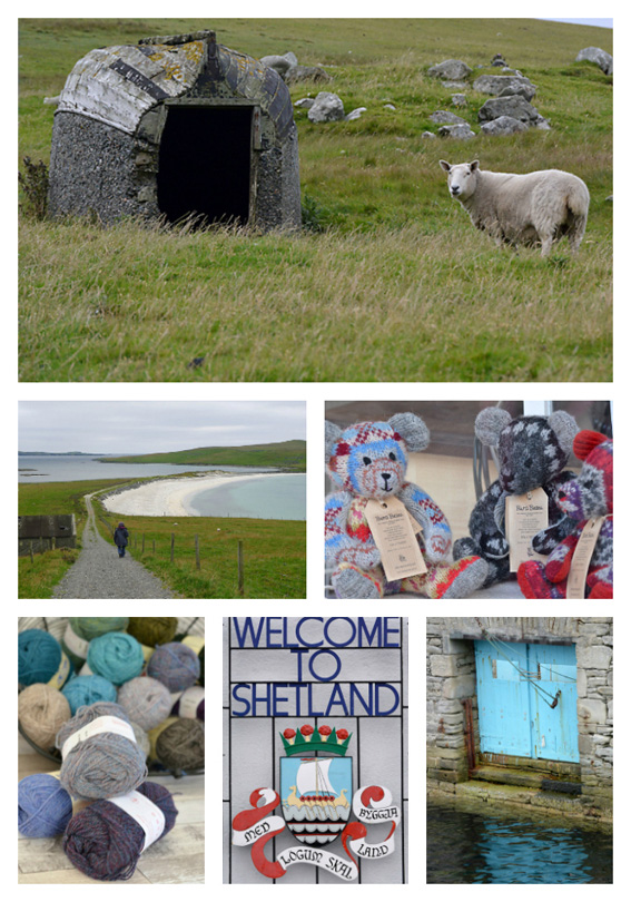
I always start by creating a collage of photos that create a sense of place, colour and bring back memories of our visit.
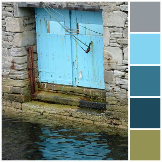
Choose one of these photos and really look at it. Select colours that you like in the photo to create the initial colour palette. For the project that I had in mind I needed 1 dark colour, 2 medium colours and 2 light colours. You’ll notice that the colours on the computer (image above) and the colours printed out (image below) are always slightly different!
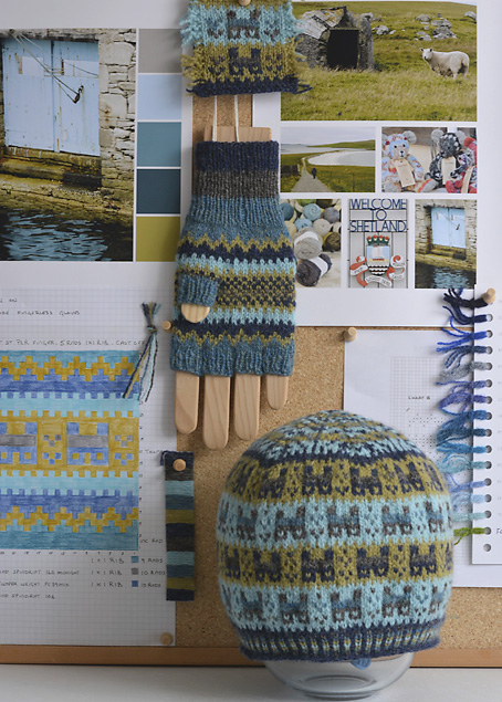
I liked my initial colour palette, but to make it work for knitting the Crofthoose Hat pattern designed by Ella Gordon for Shetland Wool Week 2016, I needed to tweak them. I chose a darker tone of the grey so I could use it as a medium colour. And I chose a darker shade of the navy to use as my dark colour. This meant that the pale blue and green became my light colours. To see if I liked how these colours work together I start by winding the yarn onto a strip of card. I loved this combination of colours together.
I used less than one 25g ball of each colour to knit both the Crofthoose Hat and my version of the Crofthoose Fingerless Gloves. The colours that I used are listed below:
- Colour A – Dark – Jamieson’s of Shetland – Shetland Spindrift 160 Midnight
- Colour B – Medium – Jamieson & Smith – 2 Ply Jumper Weight FC39Mix
- Colour C – Medium – Jamieson’s of Shetland – Shetland Spindrift 102 Shaela
- Colour D – Light – Jamieson & Smith – 2 Ply Jumper Weight 75
- Colour E – Light – Jamieson’s of Shetland – Shetland Spindrift 365 Chartreuse
Once upon a time I made a lot of patchwork and one of the tricks that quilter’s use to check that they have enough tonal contrast is to look at the fabric through a piece of red plastic. This removes the colour properties of the fabric and the overall tone will appear light, medium or dark. I use this to look at the yarns I have wound onto the card. You can also take a black and white photo of your yarns as this will do the same thing and allow you to gauge the tonal contrasts.
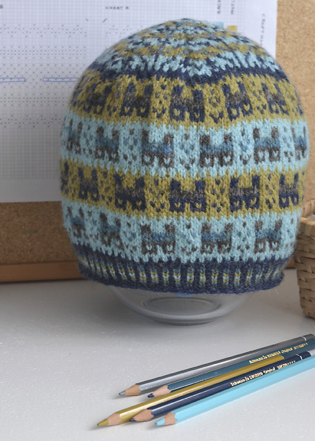
Having done this, I knit a swatch. I wanted to see how well the crofthooses would stand out against the light colours and it also allowed me to check the tension. After knitting the swatch, I washed it and pinned it out to dry, before checking the tension. My tension was coming out a bit tighter in the number of rows than the tension the designer had achieved but I liked the feel of the fabric I was achieving with this tension so I cast on. My tension was correct for the number of stitches, so I cast on the required number of stitches. The change I made was to knit an additional repeat of the crofthooses so my hat has 4 repeats of these instead of 3. I like a hat that will comfortably cover my ears.
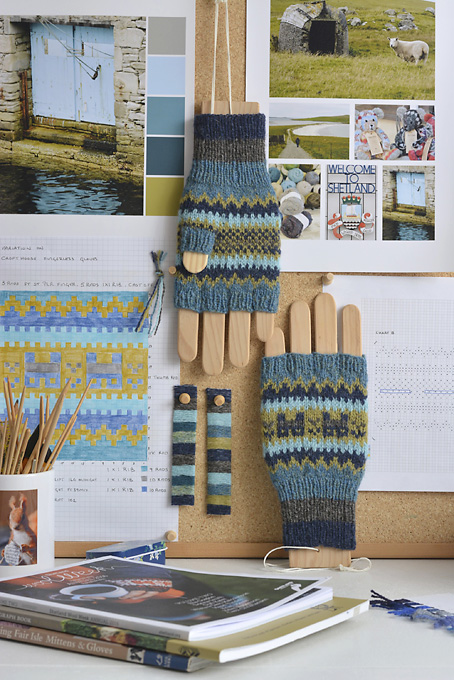
In the meantime, the copy of the Shetland Wool Week 2016 Annual arrived at the perfect moment! I decided to cast on the Crofthoose Fingerless Gloves. I was a bit concerned that they were going to be too short for me from the start of the cuff to where I was placing the waste yarn for the thumb opening as the pattern said they were small/medium in size. So when I reached this point I measured this and compared it to the same measurement on my Red Fair Isle Fingerless Mitts. There was a considerable difference. So I frogged them and reached for my graph paper and colour pencils. I make my own graph paper with squares that are 3mm x 3mm on Apple Numbers and print it out. I find that the graph paper that I can buy in the shops are either 5mm squares (which I find too large) or 1mm squares (which are just too small for colouring in).
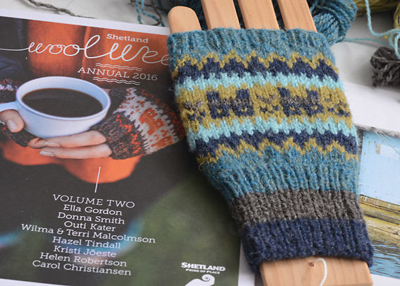
I knit a longer cuff on my Crofthoose Fingerless Gloves. Then I added in extra stripes and created a wider peerie zig zag before I knit the Crofthooses. I repeated these extra stripes and the peerie zig zag before I started the fingers.
The Crofthoose Fingerless Gloves were also designed by the talented Ella Gordon for the Shetland Wool Week 2016 Annual (Volume 2). I’m not sure if the Annual’s are still available as they sell out quite quickly. I ordered mine on the Shetland Wool Week 2016 website. It is a fabulous magazine with an interesting mix of patterns, designer profiles and articles.
How do you choose colours for your fair isle projects?

Love the way you start a new project! All the colors and matching yarns. Lucky you to have them at hand in your shop.
Where can I find the wooden mitt blocker( not the right word perhaps!!) I once bought and made a pair of sockblockers and they are great to show off. So are the gloveblockers.
Thank you for your kind comments. I have rather a large personal stash of yarn. I used to sew and knit clothes for the Sasha Dolls (Sasha Doll Style) and over a decade or more I’ve amassed a large selection of yarns mainly in 4ply/sock/jumper weight shetland which is partly why I like knitting shawls, scarves, fingerless mitts, cowls, hats and of course socks! Great way of using up some of my collection. I also like to knit a project out of the new stock when it comes in so that I can show how it looks when it is knit up. When we visited Shetland, I came home with additional supplies of shetland wool in a variety of colours from J&S and Jamieson’s. I bought my wooden glove blocker from the Spider’s Web in Lerwick when I was on holiday there. It was on my wish list! Gosh, I just love yarn in all its glorious rainbow of colours… Best wishes, Nicolette
another quick way to get an idea of tonality is to squint, almost closing eyes, this has same effect as B & w pic 🙂
That is a really useful tip! Thank you, Nicolette
oh my, those are perfect!!! I love the colours you have chosen, you are the colour-whisperer!!!
My goal this year is to try to learn fair isle, and I think the hardest part is getting the colour just right.
Beautiful, and I enjoy your blog very much.
You’ll really enjoy knitting fair isle. It isn’t so much about the colour choices as using strong tonal contrasts. A bit like patchwork, you really want to have dark, medium and light toned yarns. Also, it is best to leave the yarn that is floating behind looser than you think it should be! Otherwise, the colour work can pucker on the front. It is a bit addictive once you try. Happy knitting, Nicolette